Senior Product Designer
CAM-Hero.png

JCPenney: Customer Account Redesign


JCPenney: Customer Account Redesign

Redesigned the Customer Account Management (CAM) in order to increase usage, accessibility & compliance

line.png

Mar 2018 - May 2018
Role: UX Designer

Background

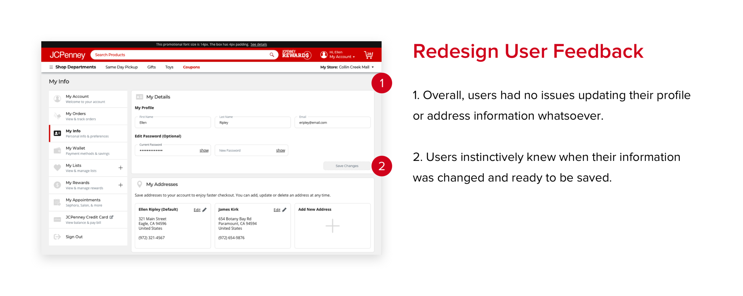
JCPenney receives tons of customer service calls a day, which leads to long waiting period for customers to get the help they need. However, most of the calls they receive are customer’s requesting for information that they already have access to through their customer account management (CAM).

I worked with a senior designer on this project along with a researcher and the development team.

Problem

The old CAM was outdated and difficult to use. Customers preferred to wait on calls with customer service rather than using the website. This led to mass abandonment issues and poor sales.

Goals

The goal was to redesign CAM in order to increase usage, self-service capabilities, accessibility and compliance.

Pain Points

After several rounds of in-depth interviews, researchers found the following issues with the old CAM -

  1. Access to information

  2. Navigational inconsistency

  3. Lack of information architecture

  4. Non-intuitive patterns and terms

Research

Competitive Research

Now that we had an understanding of the issues with our designs, we wanted to figure out how our competitors were dealing with these pain points. We recreated prototype of four leading retailers and conducted a usability study with our customers.

Open and Closed Card Sort

Research team conducted open and closed card sorting to learn where users expected each account-related action to live (Orders, Wallet, Listings, etc.)

Solving the problem

We designed multiple designs for the new CAM and compared it to the existing CAM.

1. Dashboard

Even though a landing page with a left rail was clearly preferred in the benchmark study, we wanted to make sure that a traditional dashboard was not preferred.

Current Dashboard

New Designs

Dashboard Winner

2. My Orders

Old Design

New Design - My order

My Orders was redesigned to mirror users’ primary concern: “When will it get here?”. The ability to reorder and cancel items was also added.

New Design - Order Details

Users preferred the ability to reorder or cancel items directly from the list as well as from the details page. A printable exchange/return barcode was also added. 

New Design 2.png

3. My Info

Old Design

My Info is currently split into three sections: addresses, profile settings, and notifications. 

Old Design 2.png

New Design

The My Info area was modernized, simplified, and consolidated to include account details, addresses, and email/mobile notification preferences.

New Design.png

4. My Wallet

Old Design

Currently there is no “Wallet” area of CAM. Saved payment methods, rewards, coupons, and gift cards are in separate areas of the site.

Old Design 2.png

New Design

My Wallet includes all payment methods and savings, including saved credit cards, gift cards, reward certificates, and coupons. 

Several different layouts were usability tested before the following design was landed upon.

New Design Copy.png

‘My Wallet’ Winner

Users were confused by the more “life-like” card designs and responded much better to a simpler, cleaner design with sections.

Winning - Wallet.png

5. My Lists

Old Design

New Design

Several rounds of usability studies were completed. New features include Edit Options, Add Back In Stock Alert, and Price Drop Alert.

6. Rewards

Old Design

Old Design.png

New Design

Changes include an effort to simplify rewards for customers, adding self-service features such as Missing Rewards, and adding progress for cardmember status.

New Design - Rewards.png